Huli
Creating UI Art and leading UX Design for a 2D puzzle-platformer
About the Project
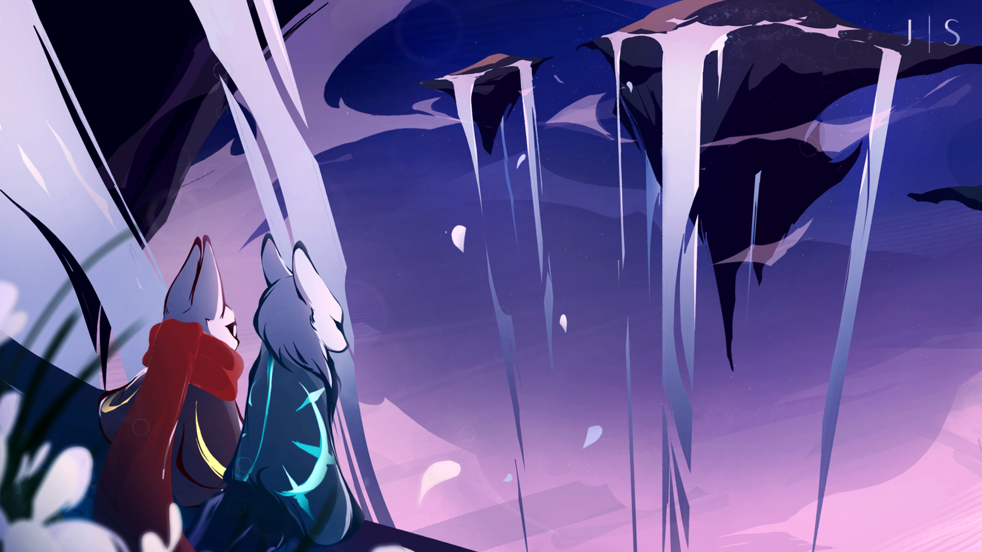
Huli is a 2D Puzzle-Platformer Adventure game for PC Desktop made in collaboration with the Portland Indie Game Squad (PIGSquad) and the Creative Media and Digital Culture Programs (CMDC Program) at Washington State University Vancouver. The project was partially funded by the Associated Students of Washington State University and took place during the Summer Slow Jams hosted by the PIGSquad in June of 2021.
My Role
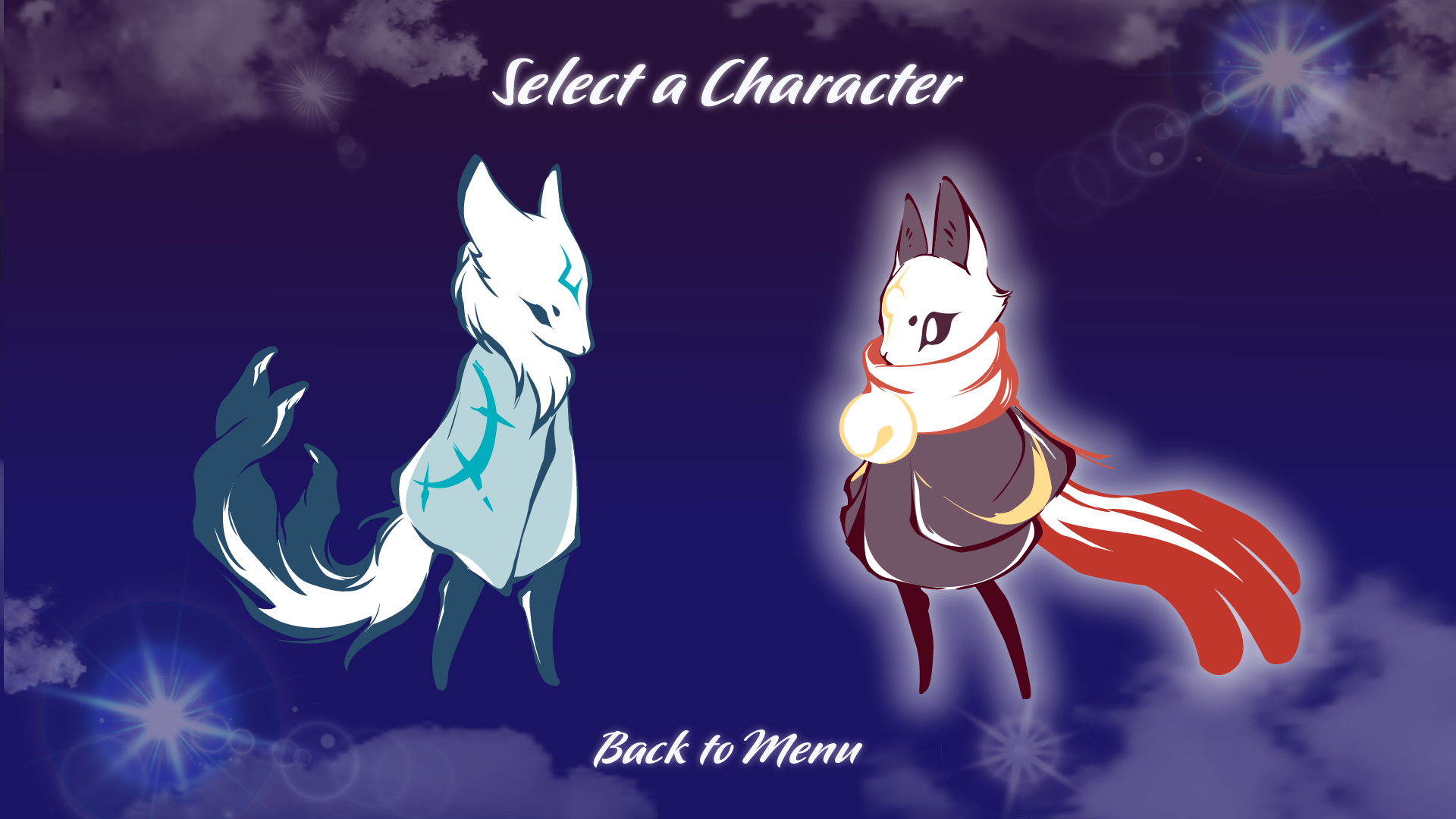
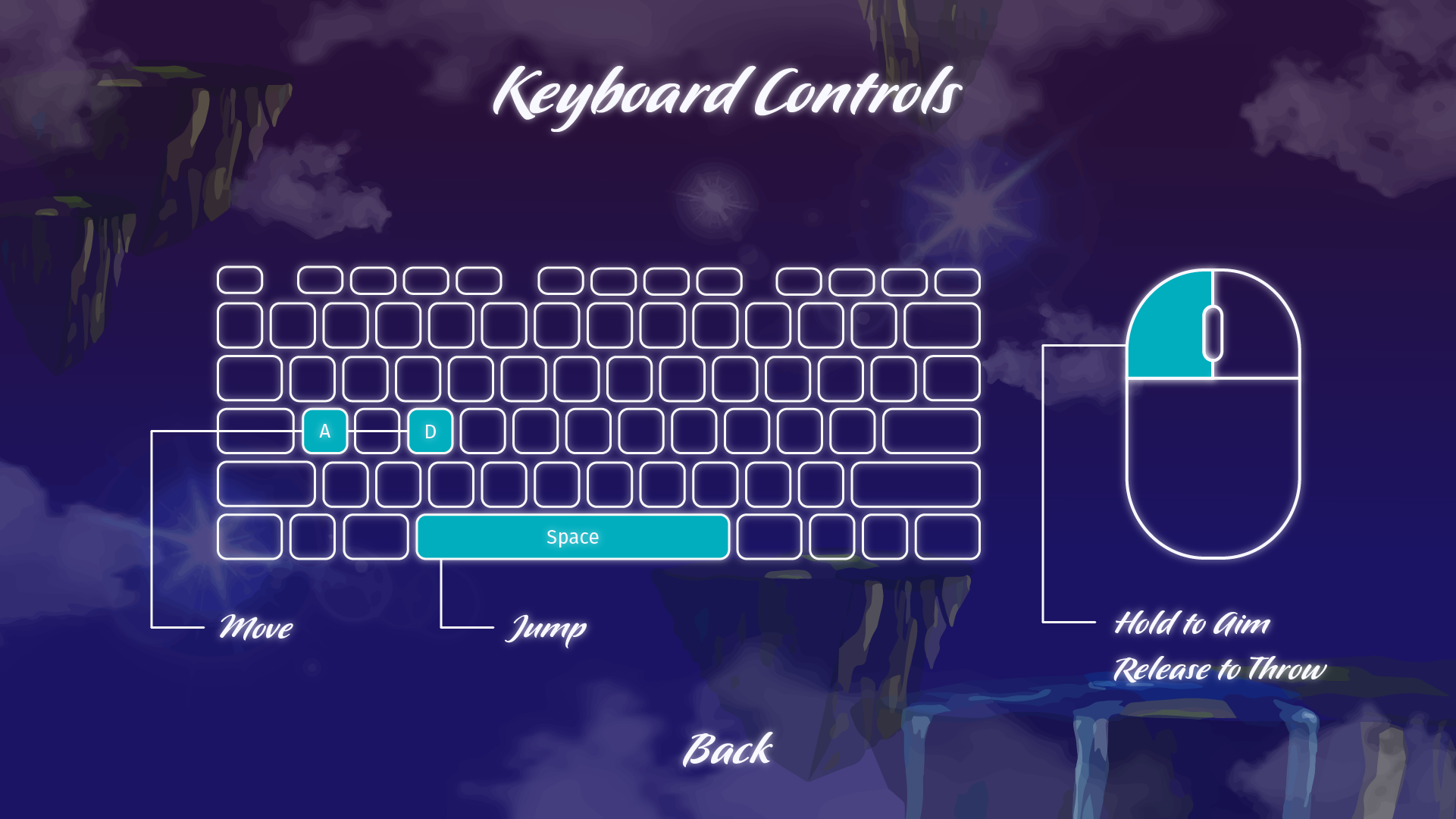
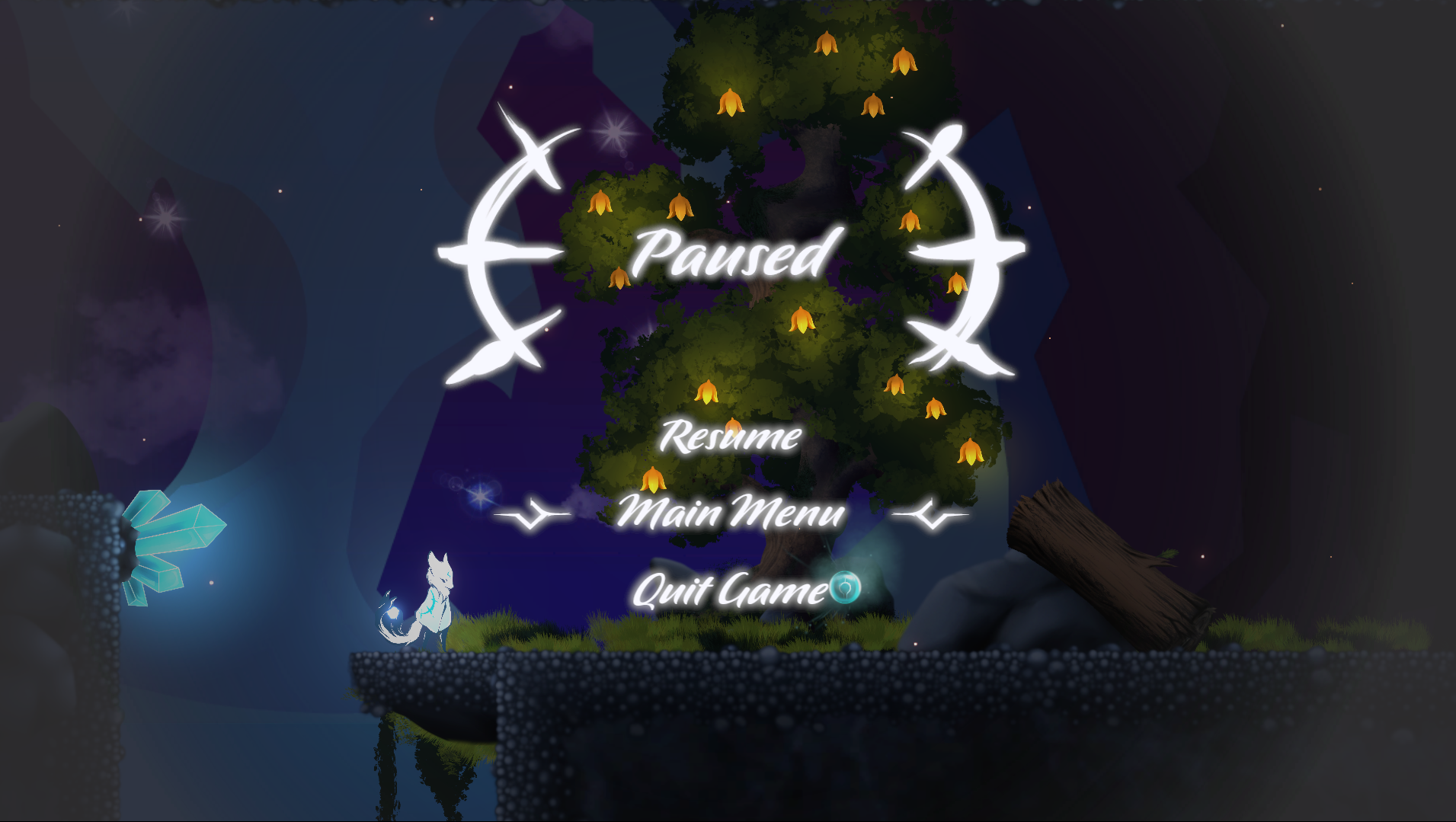
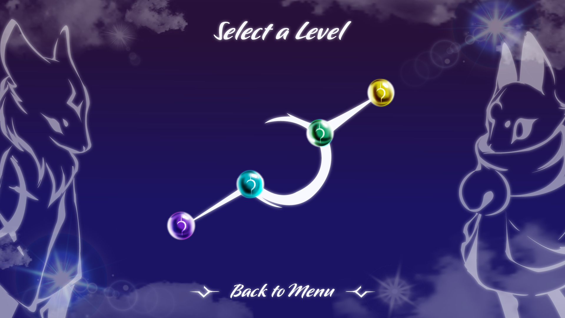
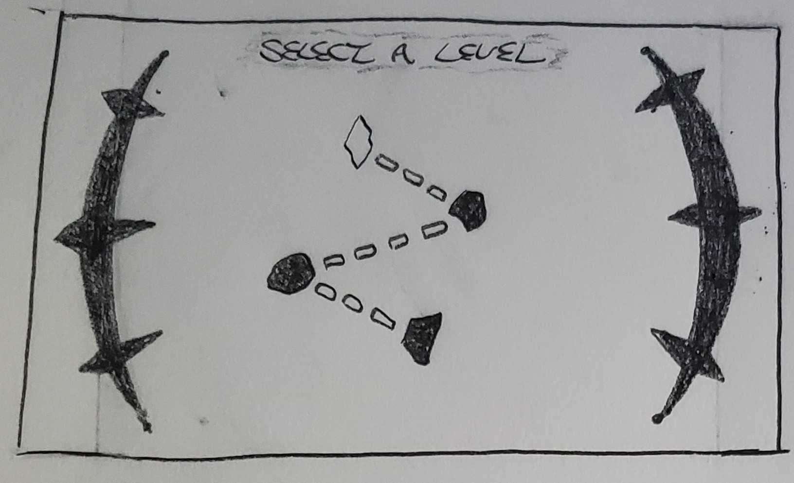
On this project I worked as the UI Artist as well as the UX/UI Team Co-Lead. In my role as the UI Artist I designed and created menus, tutorial text and other user interface assets in Adobe Illustrator and collaborated with our team of programmers to realize them within the Unity game engine.
You can view all of my UI Art for this project here!
As the UX/UI Co-Lead I was responsible for helping lead a team in the research, user experience design, copywriting and branding for the project’s two main information websites, as well as the creation of other interface assets to support the project. Members of this team included Sarah West (Co-Lead), Anabelle Castro, Grace Rouleau, Kylie Sickles, Charlie Klever, and Dave Sabrowski.
The Challenge
In order for Huli to be a successful project it would need a great user-experience to guide players through the game as well as supportive UX deliverables to help guide our game developers through the construction of the game itself in-engine. The project would also need a website to host the game upon, as well as another site to provide information on the project and it’s developers.
With only two weeks to complete the game in its entirety our team focused on creating assets we believed would benefit the project the most as well as the creation of two websites to get Huli and it’s creators the attention they deserved.
Our Approach
While most of our team were beginners in the field of game design we were all able to rely on our understanding of user experience principles and techniques to approach the challenge head-on. This project was conducted 100% remotely and the team utilized collaborative software such as Slack, Zoom and Basecamp to meet and store assets.
A Guide for Devs
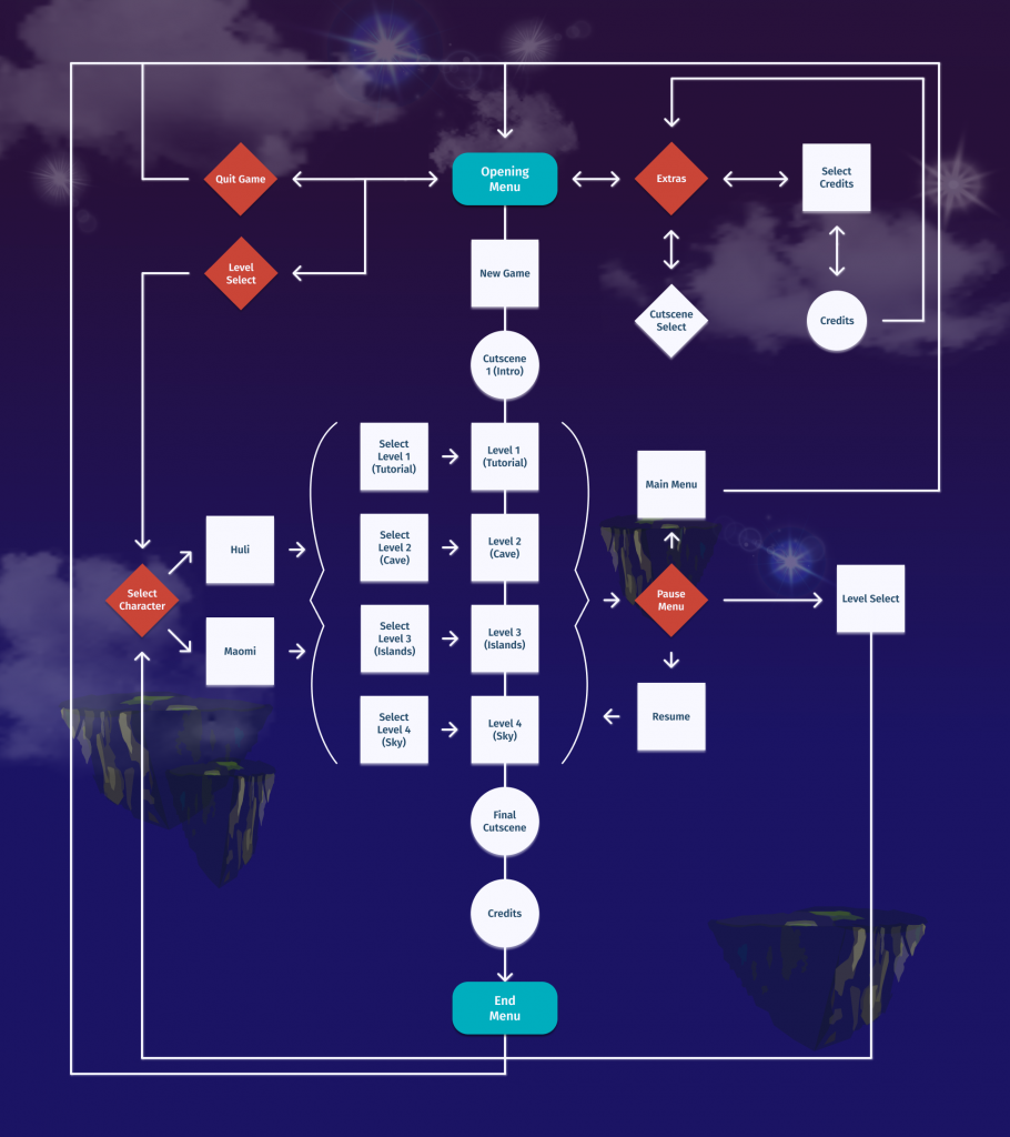
Our biggest priority as a team was creating an asset that could support our game developers working within the Unity game engine to piece Huli together. We decided that a game-flow, similar to a user flow, would be ideal as it would allow developers to refer back to a guide on where major sections of the game would occur, the arrangement of UI elements and how the user could move back and forth between them.
We spent a lot of time working with our creative director and animation team to determine the proper placing of menus, cinematics, and other game functions within the flow. Research into pre-existing games within the genre also landed itself well to the creation of the flow, as we were able to construct a layout that would be familiar and inviting to users.
A Style Guide
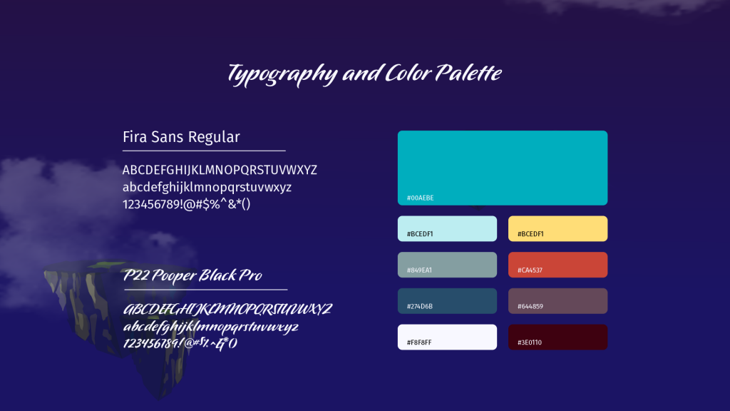
Creating a style guide not only aided our team in the construction of our two websites, but also myself in my creation of the UI art for the game. Fonts and colors were chosen to align with the mystical and fantastic vision we had for the project, and both our web developers and myself were able to utilize them to create a consistent tone and experience across all of our assets within the game and our sites.
Wireframes and Prototypes
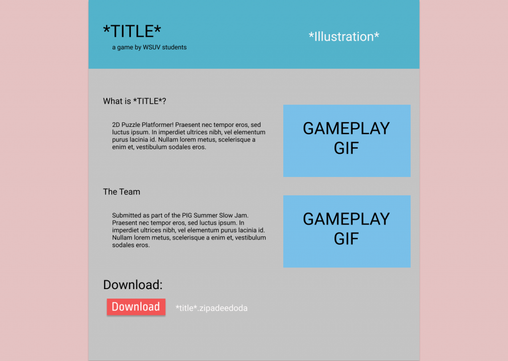
Since our game would be hosted upon itch.io, the website would follow a pre-existing template that all itch.io games must adhere to. We determined that our best course of action would be to showcase the most important aspects of the project, highlighting exciting sections of gameplay and showcasing our developers hard work to entice players to give the game a shot.
The software Figma allowed us to created a low-fidelity wireframe of the itch.io template so that our web developers could better envision the elements they would populate it with. While it could be seen as a drawback that we could not create a prototype for this website, the intuitiveness of itch.io and it’s page builder allowed us to implement changes into the final product within seconds.
Unlike the itch.io page where our game would be hosted, our gig-site was coded from scratch and extensive planning had to take place to get the end result we envisioned. Since we were on a short timeline of just two weeks we needed a way to rapidly test our design choices and resolve issues before launch.
We decided on Adobe XD as the software to use for this step, employing it’s collaboration features to divvy up work among the team and save a lot of time. We were able to communicate the transitions and interactions of the website thanks to the features at our disposal in XD and in time created a prototype that we could collect feedback on quickly. and get approval from leadership to begin coding the site.
You can view the prototype here: xd.adobe.com/view/huli-gig
As you will see, many of the design choices we made did not make it into the final version of the gig-site. However, I believe that the entire team learned a great deal about the importance of usability testing and how it can influence a product for the better.
Bringing it All Together
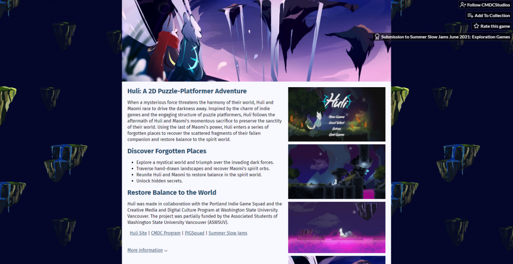
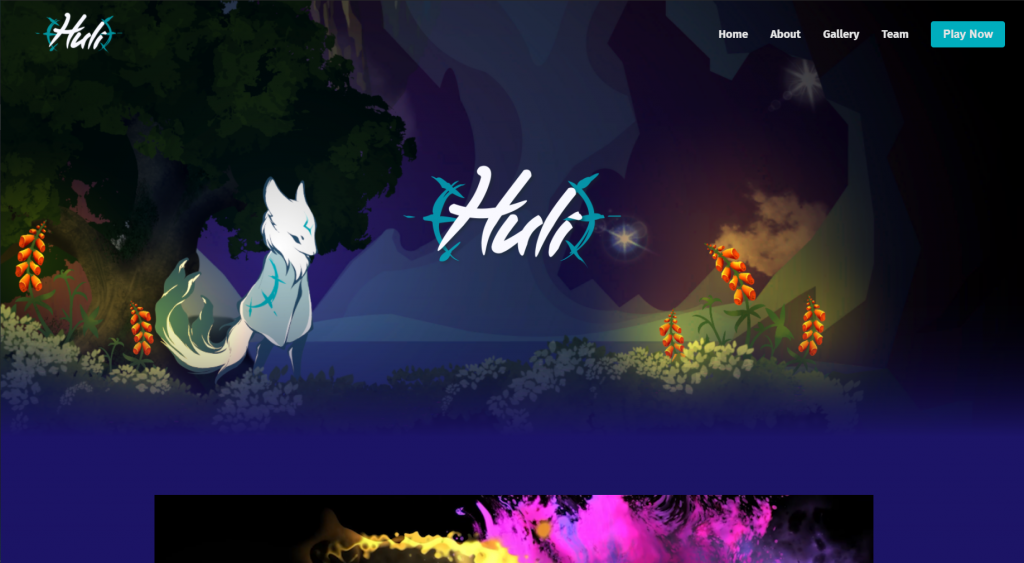
Below you will find images and links showcasing the final versions of both our itch.io page and our project gig-site.
For more information about the project please visit our gig site and itch.io page where you can play the fully released version of the game. Check out the links below!
Gig Site: huli-the-game.com
Itch.io Page: cmdcstudios.itch.io/huli
Also consider viewing the gallery and link below to see a bit of the UI art I created for the project. Thanks for reading!
You can view all of my UI Art for this project here!
