
KGW8 Mobile Case Study
Updating a Beloved Local News Provider
About the Project
KGW8 is a popular Portland, Oregon news outlet, with thousands tuning in each day to view the latest local updates. Their mobile application reflects this popularity, with over 100,000 downloads across Android and iOS devices. Despite this success, I’ve noticed areas of potential improvement for the application while using it over the last few months. I chose to redesign their mobile app as a personal endeavor to improve my UX skillset.
Roles & Timeline:
I managed all aspects of this project, from user research, through the entire design process, and prototype testing. In total the project took 3 months to complete.
Context for the Project
This journey began one morning as I was scrolling through the app looking for a particular article. I continued my search for a few minutes, using the tools available on the app, but the lack of search filters and general disorganization proved too much. This made me wonder if anyone else had run into the same issues as me.
I decided to take on the challenge of renovating KGW’s mobile app to address these issues. My overall goal for this project was to locate other problem areas within the application, formulate solutions for them, and test my knowledge of UX techniques.
Disclaimer: I am not affiliated with KGW8 in any capacity. This was just a fun personal undertaking to test my usability skills.
Current structure of the KGW8 Mobile App.
My updated structure of the app.
User Research
Usability Testing
I conducted 5 tests with current users of the KGW8 app, ranging from the ages of 21 to 67. This aligned with the KGW8 mobile apps target demographic, with mobile news application users ranging from the early 20s into the late 60s.
During testing, I asked participants to perform various tasks within the app to get a sense of how well users navigate the platform. A few of the tasks included:
- Submit a picture to the “Good Stuff” community section
- Perform a basic search for a specific article
- Locate the Preferences menu and set your news preferences
The results:
- 3 out of 5 Users were able to upload a picture to the community section
- 2 out of 5 Users found the specific news article I prompted them to find
- 0 out of 5 Users located the Preferences Menu and set their news preferences
Here are some quotes I noted during usability testing:
- “Oh… I thought it was an ad so I ignored it.”
- “Where are the search filters?”
- “I wish it were easier to find the types of articles I like and save them…”
User Pain Points
#1 – Trouble Navigating
During usability testing, many participants noted that the app felt unorganized and a chore to navigate. Others noted that in order to reach the information you were looking for, you would often need to scroll through large amounts of irrelevant information. Users were in agreement that the app would benefit in changes that specifically targeted these navigational issues.
#2 – The Lack of Search Filters
Almost all users voiced frustrations with their inability to filter results in the global search function of the app. If search queries were broad enough, users might have to scroll through dozens of articles until they found the correct one. The app was in desperate need of this quality of life feature to get users the information they desired in a timely manner.
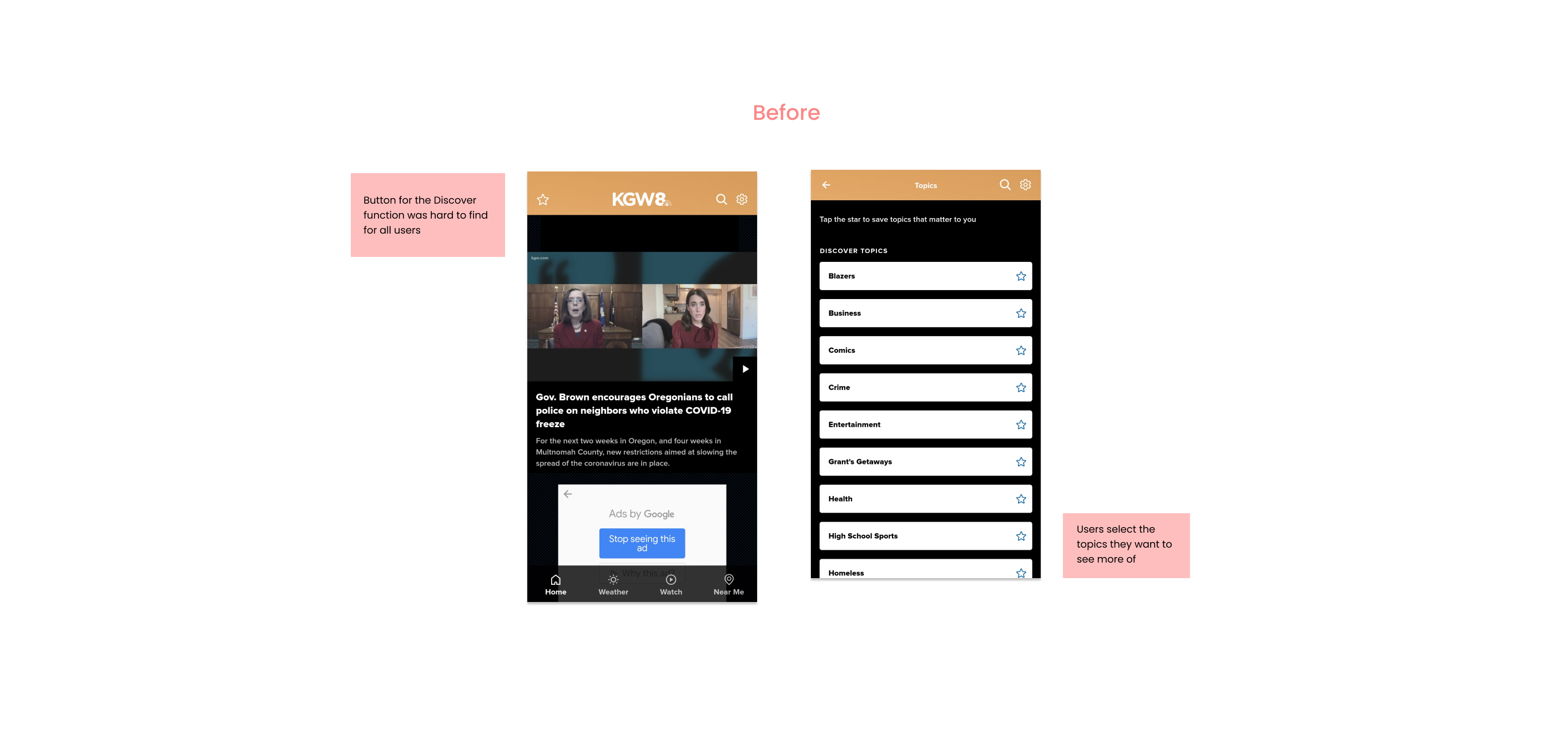
#3 – Difficulties in Finding Personalization Options
Since no participants were able to discover the Preference menu, it became clear that the feature would either need to be relocated for improved visibility, or repurposed entirely. Users also noted the lack of a feature allowing them to save articles for later viewing. Making changes to the menu and developing some sort of “Saved” article feature would likely boost user satisfaction with the app.
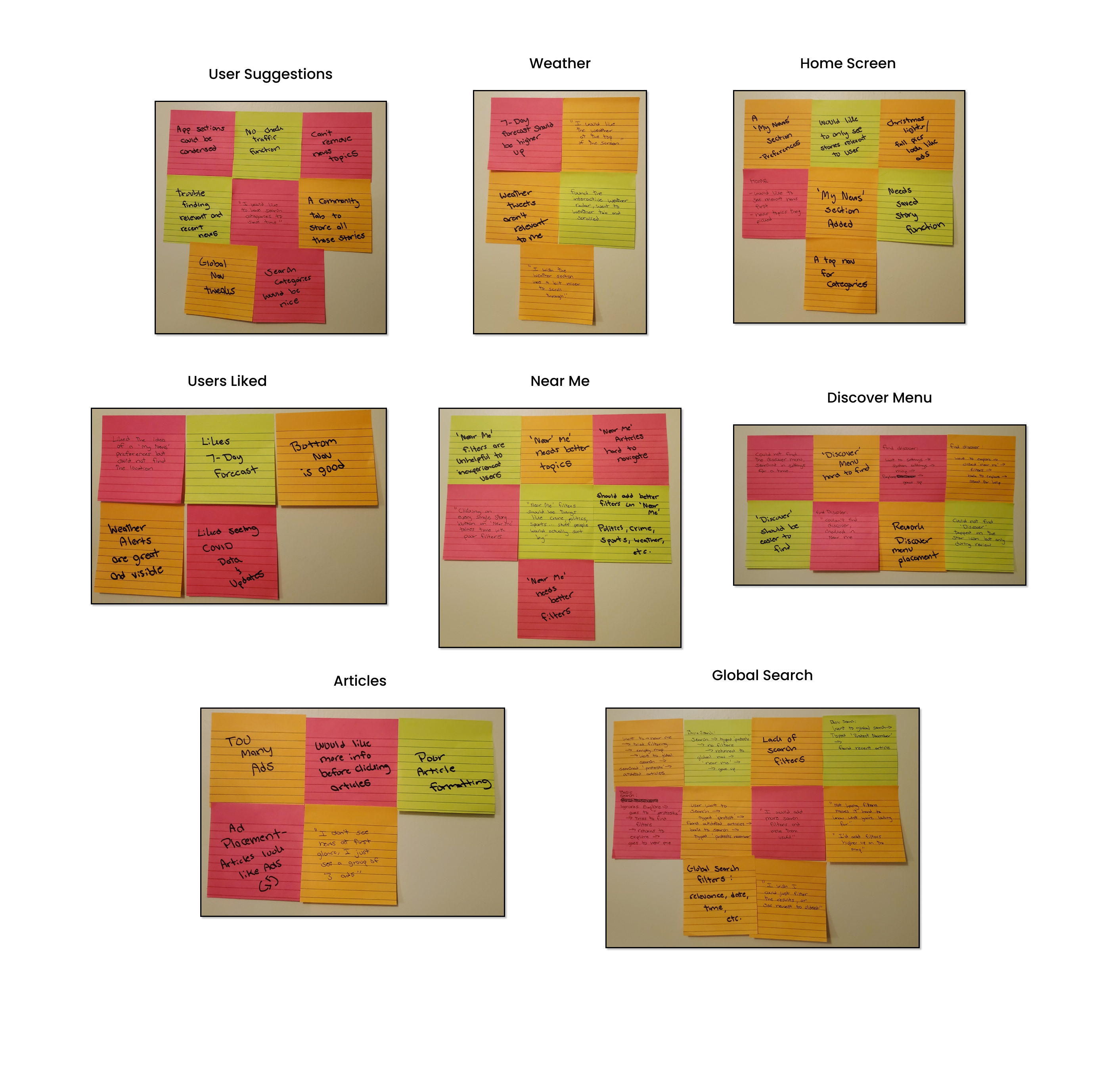
Affinity Mapping
Here I was able to visualize the issues users had with the application, and see how they stacked up together. When similar ideas like these are grouped it can better facilitate the formulation of a solution to each one.
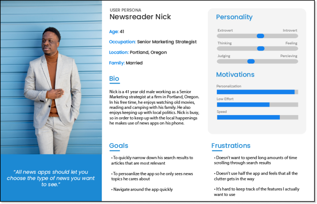
User Persona – ‘Nick’
Utilizing the data from my usability testing and affinity mapping I was able to create a user persona to empathize with users and base my design decisions on.
Ideation
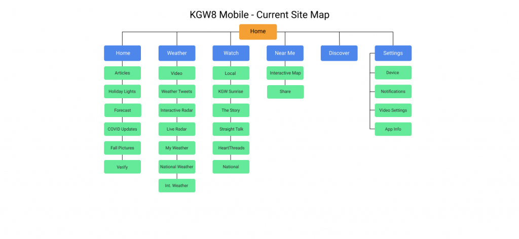
Current Site Map
Since a common issue felt by users with the app was the navigation, I felt that creating a site map would better help me understand how sections of the app connect. As you can see below, the app follows the typical hierarchy of most mobile applications, in that you need to scroll through irrelevant information to find what you are looking for.
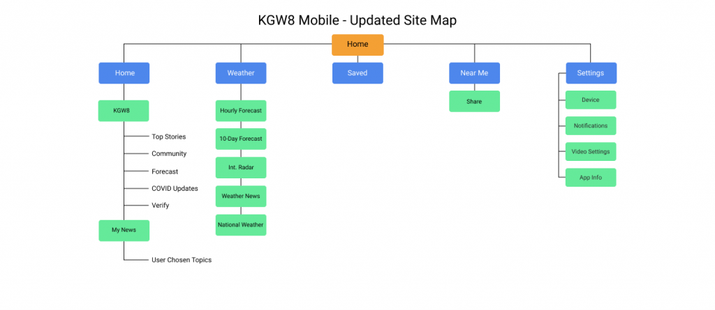
Updated Site Map
The updated site map addresses the key complaints users had with the application and allowed me to begin conceptualizing the redesign.
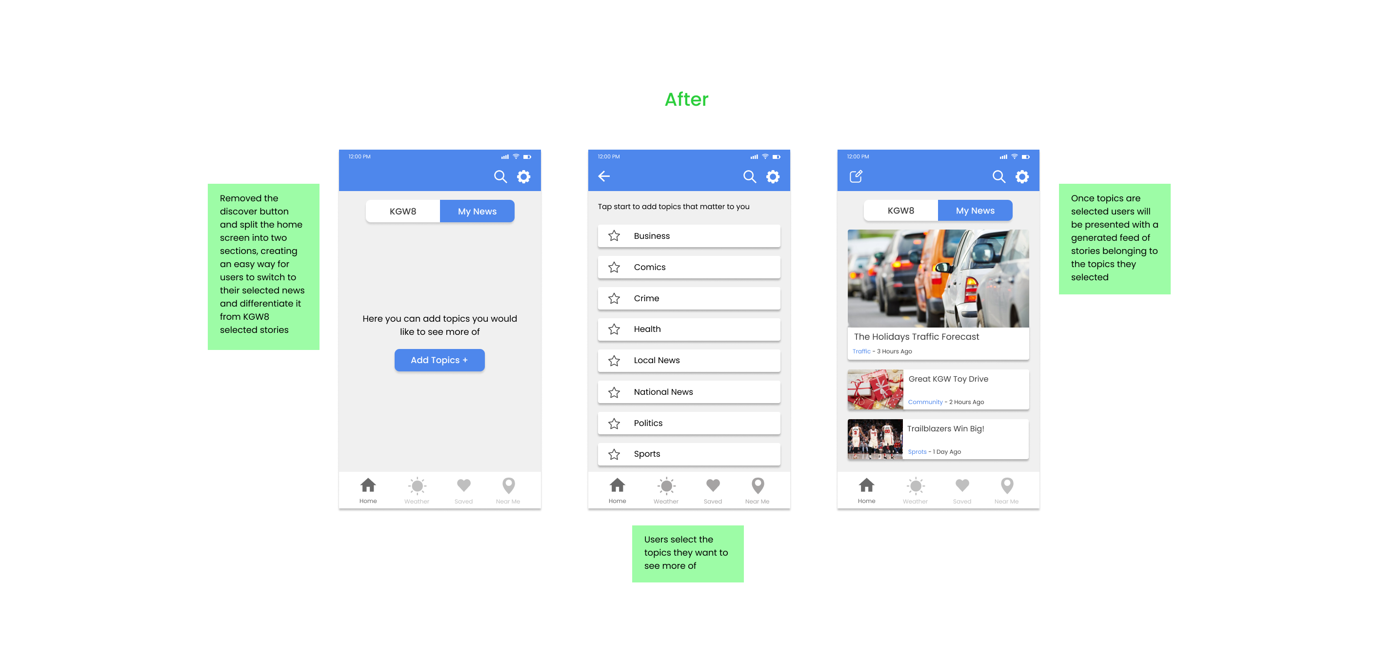
More useful sections of the app are placed higher on the hierarchy, while some sections of the app were replaced with user requested features. In addition, the home screen is now split in two so users can personalize their news viewing experience.
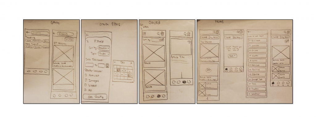
Paper Wireframing
After laying out the new site map, I could begin sketching up the changes that needed to be made to the app. I looked at each key issue users had with the app, be it with the Home screen or the lack of search filters, and formulated a solution that I felt would work best for each.

Prototyping
Beginning the Redesign
I used the online product design platform Figma to craft my high-fidelity prototypes. Below you will see the state of the app before the redesign, as well as my changes.
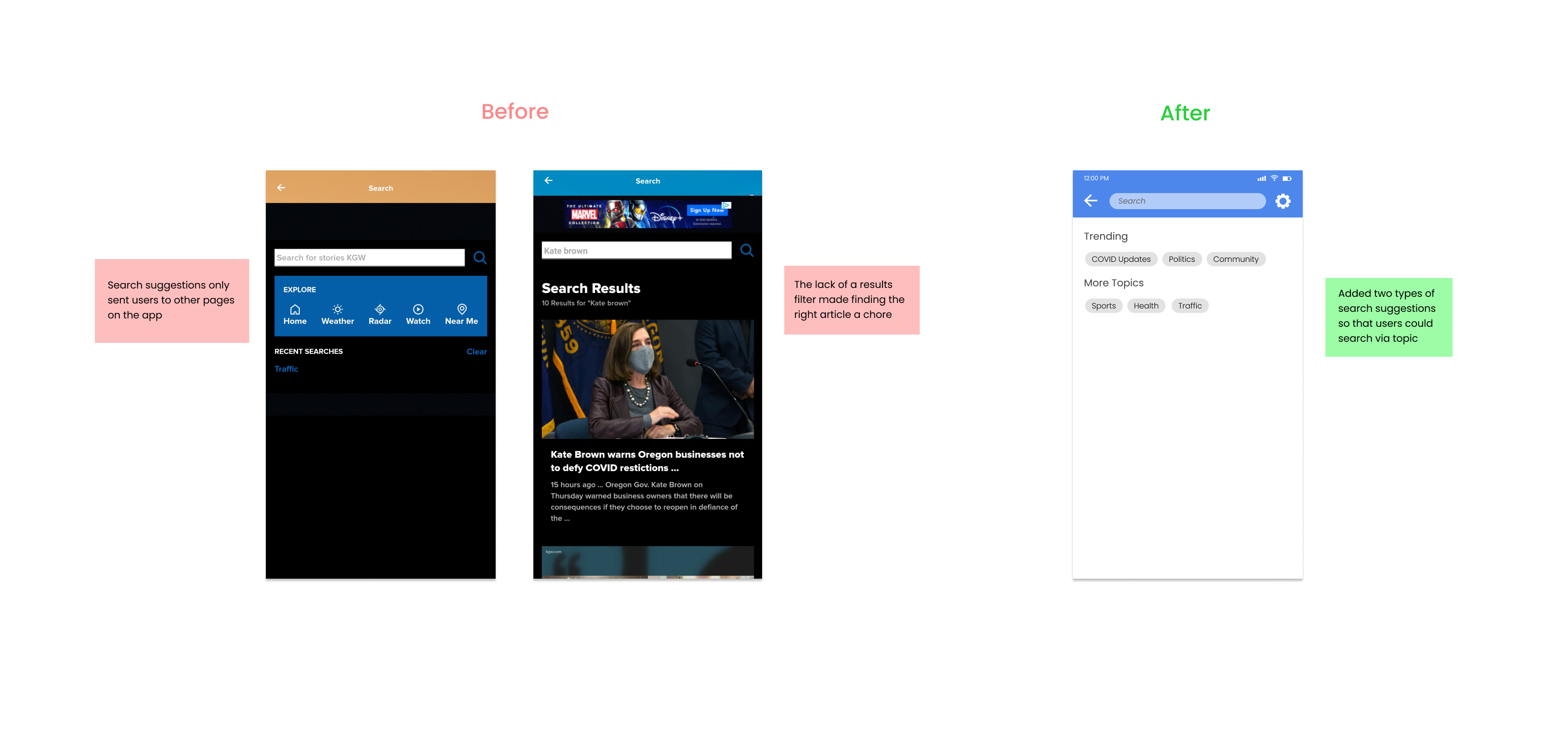
Experience #1 – A Lacking Search Function
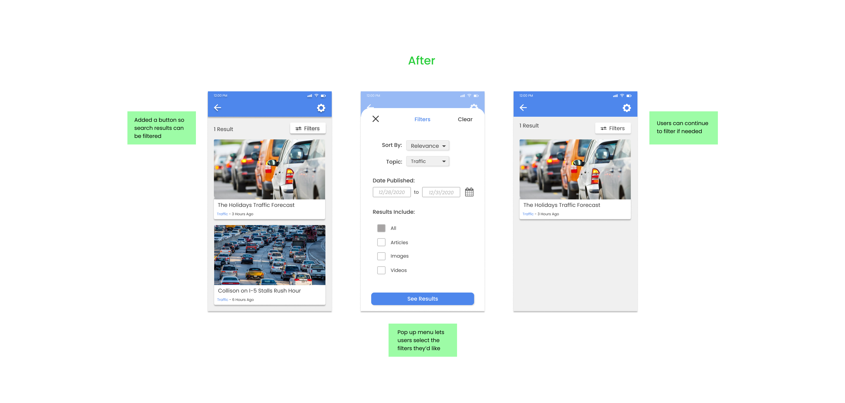
Since there is currently no search filtering function within the app, I added a filter button leading to a pop up menu, as well as search suggestion options for faster searching. Now users can narrow down their results filtering by topic, dates published, and more.
Experience #2 – A Hidden Preferences Menu
Since no users were able to locate the Preferences menu, I made the decision to relocate and repurpose it into a My News section within the app. Here, users will be able to change preferences for news topics they will see in a news feed curated for them, while having the ability to switch back to the standard home feed provided by KGW8.
Experience #3 – Disorganized Homepage
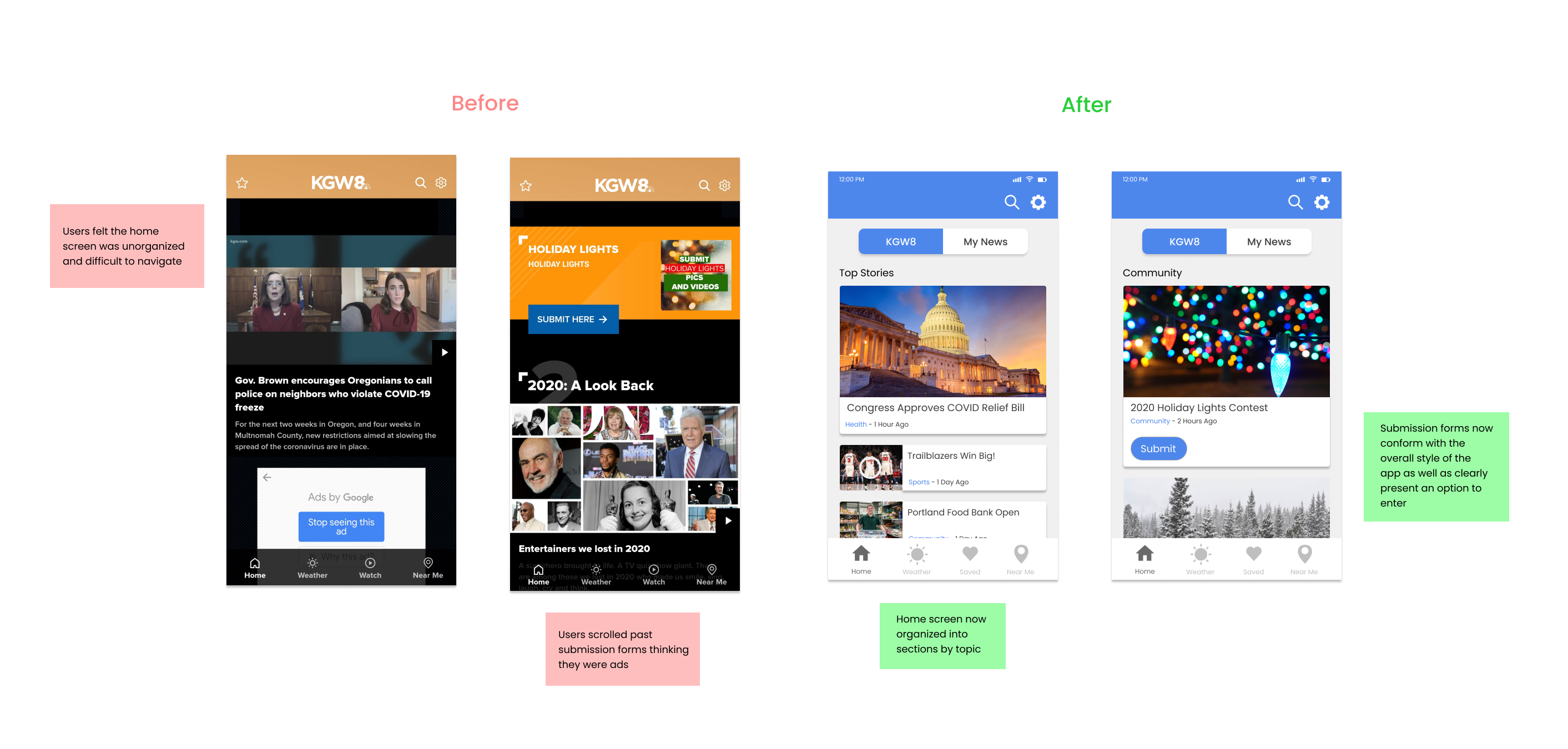
A cluttered home screen resulted in some users unintentionally scrolling past the content they were looking for, sometimes even mistaking content for advertisements. I gave each section a clear title and each article a topic tag, i.e. sports, business, etc., to give the reader more information before clicking.
Experience #4 – Weather Organization
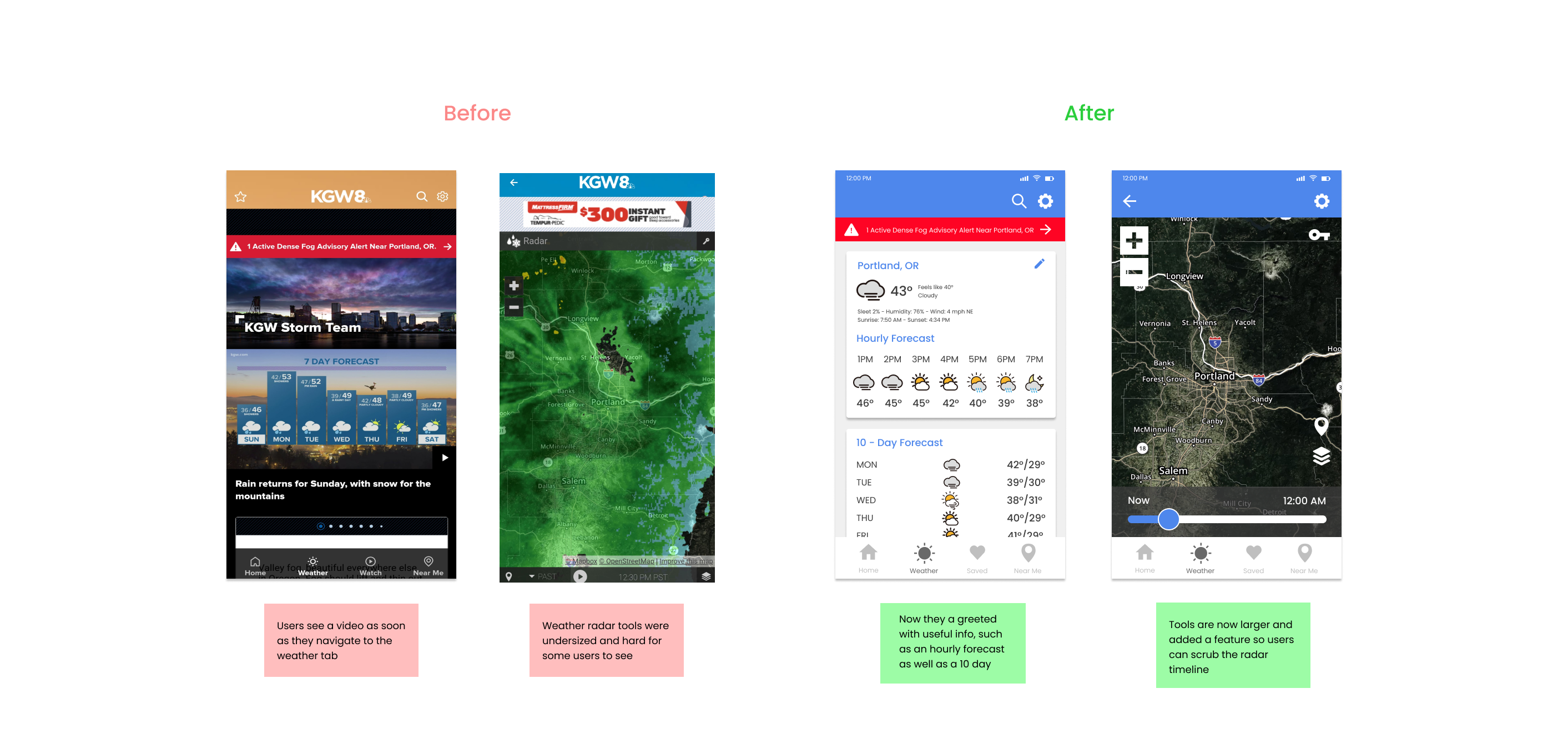
The current Weather page requires users to scroll past a video in order to view the 10-day forecast, an experience most users agreed was bothersome. I placed the 10 day forecast at the top, along with an hourly weather tracker to provide users with the important at-a-glance information first.
Experience #5 – Saving Articles
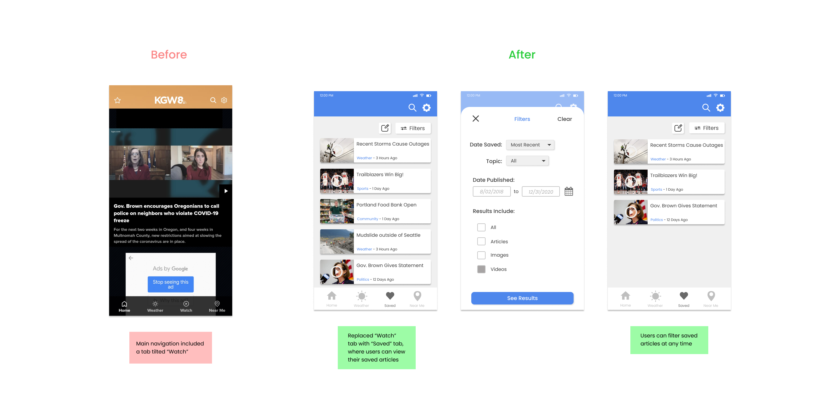
Currently, the KGW8 app does not offer users any way to save stories, so it made sense to add the feature to keep users coming back to the app. I replaced an unpopular tab on the main navigation with a saved articles menu, thus allowing users to store the stories they enjoyed.
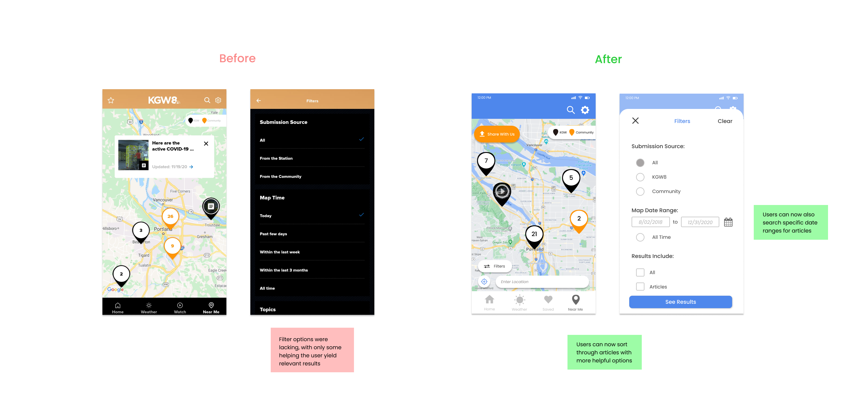
Experience #6 – Better Filters for the “Near Me” Map
In the “Near Me” section, users are supposed to be able to filter down news stories occurring near them, but can only use a select few options, even fewer of which were actually helpful in narrowing down the sometimes dozens of articles listed on the map. The changes I made now allow for the user to filter by specific date ranges, instead of the old vague options such as past few days, within the last week, and within the last 3 months.
Testing
Figma High-Fidelity Prototype
I used Figma to create a working prototype connecting all of the screens I created in the redesign. Users can scroll through the app by clicking and holding the left-mouse button, and can navigate to other sections of the app by clicking many of the icons on screen.
Please enter full-screen and take a look!
Testing the Prototype
In order to verify the effectiveness of my changes, I brought back the same five users from my first test and asked them to perform the same tasks.
The rate of success for those tasks rose exponentially with:
- 5 out of 5 users able to upload a picture to the community submissions section
- 5 out of 5 succeeding in locating the specific article I asked them to with the use of search filters
- 5 out of 5 finding the Preferences Menu and set their news preferences
Here are some of the things people said about my redesign of the KGW8 app:
- “I feel like I would use this a lot more often now.”
- “The filters were very helpful.”
- “I like that I can switch back between my news and theirs now…”
Wrapping Things Up
Reflections on the Project
This project was a massive undertaking for me, completed over the course of a few weeks in-between school assignments and finals. Throughout the process I was reminded how much effort it truly is to conduct a project such as this and also how rewarding it can be to see your skills slowly improving over time.
Looking back I see a few areas in which I could improve. I would try to find more usability test participants, and prepare more tasks and questions to guide them through the experience. I would also attempt to branch out to more software such as Marvel and InVision to better improve my skillset.
Thank you for reading!